Hanging Loose with Bil Zelman
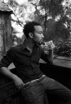 Around here we sometimes get bogged down in the technical aspects of light. That's okay. This is a niche site and we are not trying to be all things to all people.
 But balance is important in photography, even in the technical stuff itself. So today, we are going full-bore non-technical by visiting with San Diego-based photographer Bil Zelman. His airy, moment-oriented photos are loose, honest and have an unscripted, natural feel to them.
It's almost as if he whips out the old 127 film camera from the '70's, fires from the hip and all of the planets line up. Except that Bil puts a lot of work and conscious thought into making sure all of those planets line up right when and where he needs them.
Video, pix and Q&A, after the jump.
__________
I was introduced to Bil's work through an excellent interview in A Photo Editor. In it, he talks about why he engages in pro bono work for selected charities, and what he gets out of it.
I encourage you to check out the interview, even if you do not think you are interested in that type of work. He makes a great case (much better than I did) for the mutual downstream benefits, which are significant.
Appropriately, Bil's style is one that can flit effortlessly between his pro bono charity work and high-end commercial work. Take a look at the following video to get a sense of who he is before hitting the Q&A below.
__________
Q&A
When we spoke earlier on the phone, you mentioned that your initial focus on a shoot is not on light but rather on determining the emotional needs of your subject. You also have very little time in many cases. What kind of an intersection are you looking for during those few initial moments? Are you well-researched or winging it?
Every shoot has different needs. If you're shooting someone with a tight schedule, as celebrity personalities usually have, you've got to be prepared to get a great shot in 10 or 20 minutes -- regardless of how they feel.
It's usually impossible to gain someone's trust in 20 minutes, both in real life and on set. But I try to be genuine and involved in their part of the process as much as possible -- even if it's not necessary. Helping them to make wardrobe choices and showing interest in what color eye shadow the stylist is going with are tiny, easy little things that let people know that I really care about making this photo. And they’re that much more likely to trust my opinions later if I'm pushing them to do something unexpected.
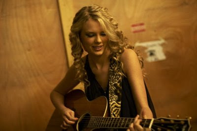
Knowing current things about the person really makes small talk that much easier, and I do try and hold conversation while shooting whenever possible. If what I'm doing is so technical that I can't entertain them, I'll sometimes have a trusted assistant ask them a question or hold their interest. On my first shoot with Taylor Swift, I actually brought a friend of mine who is a guitarist and the two of them ended up playing while I shot.
Shooting good portraits is equal parts psychology, trust and technical expertise -- with the technical part probably being the least important. (I'm going to get hate mail writing things like that here huh?).
Your shooting style is loose and natural, and yet the light always seems to to be working for you in lots of subtle ways. Can you talk about why you frequently prefer to use dark cloths for subtractive lighting rather than working above the ambient with strobes?
For one thing, it's easier and often faster to set up a few black cloths than to drag out the packs, heads, modifiers, run power cables or generators etc.
I easily own $25k in lighting gear -- Speedotrons, Dynalite, Elinchrom gear etc, -- and often pack it all into a cargo van and bring it along just in case. But the best results are often found more simply. If I can find nice flat light, and sculpt it into something more contrasty and dimensional, it looks a lot more natural. I don't have to worry about staying within shutter sync or using ND filtration to knock things down, waiting for recycle times or having all those incredibly annoying flashes going off and ruining the mood. (Sorry Strobists!)
And don't get me wrong- There's a time and place for strobe, but it's only a tool and there are lots of other ways to work. In order for me to achieve a very natural looking light source with strobes and still have room for my subject to move around, I'd need HUGE light banks like the ones car shooters use.
I remember that you specifically had it in for "green uplighting," as you called the light reflecting off of grass outdoors. That is to say that you love to kill it with a dark cloth on the ground. Can you really help shape someone's face with just a black cloth on the ground?
Absolutely. Everyone ends up shooting in mid-day sun and positioning their subject in the shade of a tree at sometime or another. When that person's standing there they have two light sources: The blue light coming from the sky above and a bright green light coming from the sun hitting the grass below. You can't color balance for them both. What ends up happening is you set your white balance or filtration to warm the scene and take out the blue main light, and leave this bright green "up light" under their chin and in the sockets of their eyes, etc. I see it all the time in print.
Throwing a cheap black cloth on the ground in front of them not only corrects the color issue, but it also gives the lighting more contrast on the vertical axis. Which, in turn, gives everyone a better looking chin line, which makes people look thinner, etc.
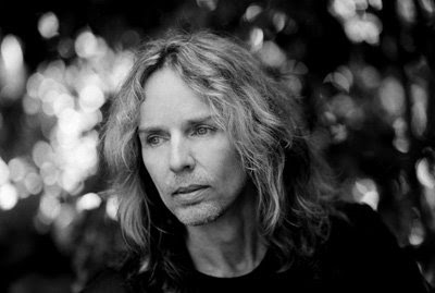
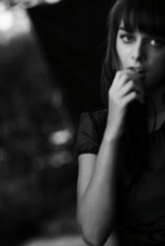
Ideally, in this situation I'd throw an 8x8 cloth on the ground and set two black 6x6 scrims on either side to bring out their cheek bones. This configuration is the one use on the Tommy Shaw portrait and the blurry female model as well -- both of which were shot in backyards in "normal shade".
For the record, I had a sail maker sew pieces of black Duvateen together into 8x8, 12x12 and 18x24 configurations, along with grommet holes every 16 inches which can then be tied to regular background stands and raised. Scrim Jim makes great frames, although they're pricey and there are other options. You could buy black cloth anywhere and have someone hand hold it, throw it over two ladders -- whatever. The camera won’t know you didn’t have a sail maker sew them up.
Also, black felt is actually shiny at a forty-five degree angle and doesn’t work very well. Stick with the dull stuff the movie industry uses like Duvateen if you can.
One thing you said in an earlier conversation really stuck with me: "Focus is overrated." As a long-time news / sports shooter, that kinda made my head explode a little. But at the same time, the look resonates. What is it that will make you decide to veer so far away from convention on a shoot? Do you play it safe and shoot both ways? That must take a lot of confidence in your personal vision -- how do your clients react to this?
 This brings a smile to my face. One of my best commercial clients has often offered to pay me more if I’ll make more of the images sharp. But I still like to shake the camera...
As far as blur goes there are all kind of beautiful things you can do with it. (But please, no more 1995 ”pop-the-flash-and-drag-the-shutter stuff”). You see it in great work everywhere from Richard Avedon to Sally Mann to Robert Capa.
Like anything, it’s a style thing. Standing still and racking your lens out of focus probably won’t be very interesting. But if you're walking backwards and you're subject is waking towards you and you're shooting at a 30th with a 50mm, you’ll probably get frames where the person has motion blur and the background doesn’t and vica-versa. This can bring a lot of excitement to a shot, separate the subject from the environment and also give your subject something to do other than stand there and look at you. Make your subject DO THINGS.
One of my favorite looks is shooting T-Max 3200 and shaking the camera while I shoot. The image comes out soft, but the large grain gives your eye something to focus on when you’re viewing the print. Visual texture is something fine print makers used to talk about all the time, from grain structure modification with developers to darkroom paper choices. But most of those things are now overlooked. Blur can be one of them.
I’ve kept my Nikon D2x solely for it’s awful noise at high ISO for just these reasons. It can be painterly and gorgeous with the right subject matter.
In general, many of your photos are stripped of the Nth-degree technicals and are built entirely on emotion and moment -- a leap of faith that is impossible for many photographers to make. How did you make that jump? A little at a time, or all at once? How has it changed you?
You know, this is so hard to answer!
I’ve always shot very quickly and playfully with a lot of direction and background changes. I don’t believe that there’s a single image on my website that’s been cropped at all, and I’ve always been that way.
I take the kind of photos that don’t really need much screwing around with, I suppose. And I wouldn’t be the guy to do it if they weren’t. Photoshop was something I resisted using for years, but I’m now pretty good with it and clean things up and sometimes remove things and such. But I would never use it to try and make a dull photo interesting -- which we now see a lot of.
People have been making remarkably impactful images for 150 years without HDR or high pass filters and I suppose I’ll end up being one of them. Perhaps I’m boring?
Don't take this the wrong way, because it is meant as a compliment: In many ways, your work has evolved (or maybe regressed?) into a look that is almost childlike. Like those projects that give cameras to a group of kids and edit the take down to beautiful work that is free of convention and restriction. If you could talk to yourself as a photographer 20 years ago, what advice would you give?
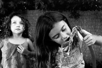
Can we say naiveté in place of childlike? I once had an art history professor refer to the naiveté of Julia Margaret Cameron's work and I thought it to be so poignant. I don’t believe I’ve even thought of that moment until now, but it’s interesting because she played with focus and blur and time exposures and was largely ridiculed for it. But try and purchase one of her photos now!
I suppose I’ve always wanted to believe that some photos are real, and leaving in a few mistakes and not being technically obsessed helps me with this. It’s almost as if I’m documenting my own photo shoots if that makes any sense at all? Method acting and letting people be who they are. (You can actually see one of my black cloths and stands in the blurry shot of the girl...)
If I had to give advice to anyone at all, it might be to know your tools inside and out, but not let them get in the way. I can go from a 125th to a 30th and from f2.8 to 5.6 while walking backwards and holding conversation without missing a beat. Add too much more to that equation and I’m paying more attention to my gear than to my subject -- not a good thing.
That, and take lots and lots of pictures.
__________
See more of Bil's work at Zelman Studios.
(All photos © Bil Zelman.)
__________
New to Strobist? Start here | Or jump right to Lighting 101
Now available in audiobook: The Traveling Photograher's Manifesto
Permalink

<< Home