Chris Waind's Epic NZSO Compositions
 Photos ©Chris Waind. Click on any pic to embiggen.
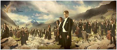
Wellington, New Zealand-based photographer/illustrator Chris Waind used a motley crew of inexpensive lights -- along with some Photoshop and a lot of creativity -- to create a visual campaign for the New Zealand Symphony Orchestra.
The goal: to lower the age demo of the audience and raise ticket sales. When the dust had settled, ticket sales were up 20% during a recession.
Keep reading for sketches, final images, a BTS vid and a full interview with Chris.
__________
Ed. note: Normally when I interview a photographer for a BTS piece, I do a Q&A and then extract an article from it. But Chris was so generous and comprehensive in his answers that I did not want to shortchange him one bit. But first, the BTS video:
Concept
Where did this germinate? You? Them? Alcohol? And how did it progress -- how much was set in stone and how much evolved on the fly?
We started to work with the NZSO in 2009. Their existing brand was old, tired, and largely irrelevant to anyone apart from their core audience. They were a 'blank canvas' client: we stripped everything back and then together, started to tell a story that truly represented the orchestra and the often misunderstood genre of classical music.


For the 2011 brochure the primary objectives of the brief were relatively simple: 1) Increase ticket sales and 2) Engage a new, younger audience. From this we set about looking at both the orchestra and its connection to the audience. What made the performance so special? What sucks you into the music? What makes the listener form a connection to the players? At the very first concert I went to, I found the first couple of pieces quite overwhelming, but before the third set the conductor addressed the audience and told a brief story about the origins of the piece. This completely changed my experience of the performance. The narrative, the story behind the music is often as powerful, colorful, romantic, and revolutionary as the music itself. It was this narrative we wanted to use to take people through the world of classical music using the actual players as the actors.
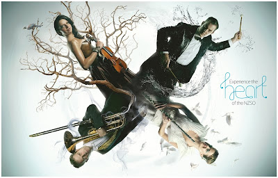
Pitching this idea was another story. It was tricky because we didn't have great reference examples of what we wanted to achieve. So I made some rough concept sketches, and we put together mood boards, test shots, narrative extracts and we sold in the concept. The marketing manager at the NZSO really got behind the idea and saw the potential. We crafted the concept and formed 5 photographic montages along with a front cover orchestra portrait. Each of the montages uses the stories, the history and the legends behind the pieces of music to create the scene.
The other thing that made this project slightly different is the fact that I wanted to remain hands on through every aspect of the project - from conception to post-production. Although this saddled me with an almost overwhelming amount of work, it allowed me to control every aspect of the image. When I take a shot I always have the Photoshop work in mind, this allows me to take a range of shots that I frankenstein together later and gives me a lot of flexibility in the composition.


Photography purists would hate me, and rightly so. The photos are just a starting point for me, the rest is built up like an illustration. I'll use textures, build in 3D, draw/paint, and distort until I get the result I want. I'm happy with this process, the only downside being that it's quite a slow one. I gradually build up the layers, each one chiseling away at the block until the right image emerges. The trap to avoid is getting stuck on a certain detail of the picture and wasting time.
I decided to do a screen recording while I worked so I could keep a check on how much progress I had made throughout the day, which also made some nice footage for the 'making of' movie.
Lighting

I notice you used a mix of big light (model?) and speedlights for the shoots. Was this by choice or necessity? Do you work this way a lot?
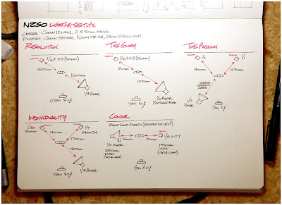
The big studio light is a an el cheapo generic brand 250 watter, and I compliment this with a Canon 580 EXII and a Nikon SB-28. The reason for using this did ultimately come down to necessity. I would have loved to have hired out the local studio and have all their equipment at my disposal, but the schedule of the orchestra meant that we could only shoot one player at a time, so we just couldn't afford to do that. I also needed something I could set up quickly and could operate in a small space. It's not flash (excuse the pun), but the results are extremely effective.


Lighting continuity -- this kept hitting me as I watched the video. What was the process of maintaining the continuity as you shot the to-be-composited chunks? Did the pieces to be rotated (angel at the death scene, for instance) give you problems?
This was a bit of an issue. Due to the scheduling of the musicians, I never had all the players for the same scene in on the same day. Plus when I did have them in the studio we were pushed for time, so playing around with the lighting and experimenting on the fly was out the window.
To get around this, I used everyone in the office as test models before-hand and played around until I was happy with a setup. I then simply wrote down the settings, added notes to the sketches, and adjusted on the day to account for the costume, material, hair, etc.
The angel you mention was a bit of a challenge. We tried a variety of balancing acts to get her flying, but I opted to shoot her facing upwards and spent 2 hours capturing every possible angle and pose. As it turned out, I ended up using the very first shot I took.
The Shoot


Looks like you did this in a fairly spartan / modest location. Was it tough to get people to visualize the final product and keep the mojo going? Did the fact that they are creative people help you there?
Because I couldn't hire a space to shoot in, I had to improvise. In the end, I ripped out the reception area of the office and threw up some natural cotton material for a cyclorama. Although it looked a bit ghetto, it was a perfect location and gave me both an incline and decline viewpoint because of the stairwell. Meeting room 1 was turned into the green room, and meeting room 2 was the wardrobe/makeup unit.
Getting people to visualize the final product whilst they're sitting in a saddle, balanced on a prop horse constructed from fence posts, foam and concrete blocks, is a tall order. But the musicians were incredible to work with. They put in nothing but 100% and really brought the project to life.
We were also lucky enough to work with Dara Wakely, who is a makeup artist and stylist for a lot of Peter Jackson's projects. She sourced a stunning array of garments for each piece, and completely transformed each musician into their character.
From a client perspective, it did require a degree of trust in our methods, and faith in our ability to execute the project to the highest standard. As a marketing manager, it's very easy to take the safe route and stick to the tried and tested. But the client was on the same page as us when it came to pushing the brand into new territory and taking a bit of a risk. This ultimately payed off and new ticket sales went up over 20%. In a recession year this was a massive achievement.
Ed. note: You can download the .pdf version of the entire brochure here. (Sorry, person who monitor's NZSO's website bandwidth.)
Going Back to the Well

In an earlier email you said you are already in the process for the upcoming season's composites. Have you created a monster? What have you learned / how are you trying to one-up yourself?
Yes, it is a bit of a monster. Last year was a very steep learning curve that kept me on my feet. I also believe I set the world record for the amount of cups of tea consumed within a 24hr period.
This year is all about stepping the compositions up a notch. I did a lot more sketching and planning to give more of a dynamic to each image. Because of this, the Photoshop time has gone up, which pretty much took care of every weekend in July. Stay tuned and I'll be back to take you through the new set once they're done. In the meantime, updates will be posted to twitter @chris_waind.
__________
Ed. note: Interestingly, if not depressingly, Chris does not primarily refer to himself as a photographer. He's a quintuple threat, with photography merely getting third billing. Check out his work:
:: www.etsy.com/shop/chriswaind ::
:: www.chriswaind.com ::
__________
New to Strobist? Start here | Or jump right to Lighting 101
My new book: The Traveling Photograher's Manifesto
Permalink
<< Home