A Little Grecco-To-Go for Your Tablet

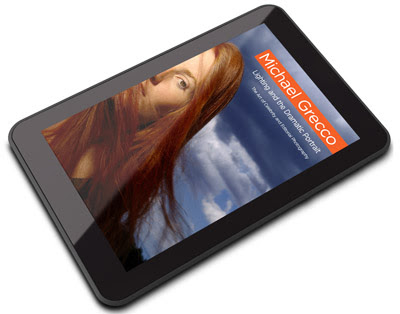
Michael Grecco's Lighting and the Dramatic Portrait has been one of my favorite lighting books since it was released back in late 2006. That was far enough back to where publishers were not yet insisting on all of the e-Rights. So Grecco has done what any smart photographer would do, and has just co-released LatDP as a multi-platform eBook.
In fact, just thinking about all of the amazing photo books that were published before e-Anything makes me realize there is a huge i-Library just waiting to happen. And in a way which will see the royalties go where they rightly belong.
On top of that, we can support photogs directly (no offense, 90%-taking mega-publishers) while toting around a bucketload of inspiration on our tablets, phones, pods, etc.
In honor of the new LatDP medium, I asked Michael if he would give a little extra BTS on one of my favorite images from the book. You know, a lil sump'm sump'm just for us.
And he did…
__________
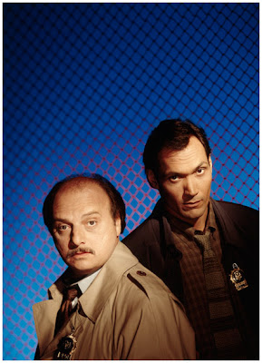
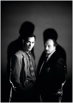
Jimmy Smits and Dennis Franz for Entertainment Weekly
Ed note: Except where noted, Grecco now has the mic.
Two shoots brought me to an epiphany early in my portrait career- the first being my X-Files shoot; the second being this. The epiphany did not come because of the way I lit the picture; that just sort of came to me. It was because while I was shooting a different image, on a blue background, for the cover for Entertainment Weekly the Picture Editor, Michael Kochman, took me aside and told me to “do my thing." It was a vote of confidence, an urging to push it one step further. He was saying, “The cover you are shooting is cool, but I know you have even cooler, more personal, images in your head.” He was right.

The first idea was to use a brightly-colored orange fence, like the ones used to cordon off danger zones, with a bright blue background. I wanted to make the EW cover "pop." But Michael pushed me for a moodier, alternative version. I loved the idea. In fact, to prepare, Kochman had me screen the Orson Welles film noir classic "Touch of Evil."
The thinking was that this was a TV show about cops, so why not say that by putting the subjects into a film noir setting. We would tell the story of who they are visually. Film noir is defined by its shadows and dramatic use of lighting. I knew how I wanted to create that: I made shadows with a custom-made Fresnel light that I use with my Dyna-lites. But now two unexpected problems emerged: If I under-lit the subjects (lit them from below), they would look horrible, so I had to find the shadow without under-lighting the faces.
I like making myself open to my intuition - I have had a long-time yoga and meditation practice—so I let my subconscious brain pass through my conscious brain. The solution revealed itself to simply make the shadows independent from the main light source on their faces. I did not need to remove all the under-lighting- just enough so it was not prominent.
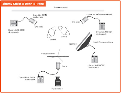
The bigger problem was that the guys did not have perfect skin, so I could not use a hard light source. I needed to light their faces from a more flattering angle, but that light was going to wash-out the background shadow. A soft-box would have been perfect, but as a source the light spreads everywhere. Fortunately, I had prepared for this possibility and brought specially made grids, honey comb metal the size of the surface of the soft box. Now, I use this trick all the time- the gridded soft-box. It’s a tight light and soft light at the same time. Since this shoot Light Tools has created lightweight fabric grids for my Chimera soft-boxes that I can easily travel.
The remaining trick here was to make the two main lights work together. As I studied the Polaroids I knew the shot was too dark. There was a lack of detail in the bottom half of the image. To fix this, I added two back-lights, but just to the bottom half of the image, placing them on the floor. That was where it was needed, and I hate doing things that look traditional, like a common back-light on the hair or head. That would have been the formulaic way of doing it, so this was my solution.

The last thing to do was to balance everything by looking at the Polaroids. (Now I do the same thing with a laptop or tower with a large monitor.) I calibrate the screen with my EyeOne profiler and then make adjustments until everything is balanced the way I like. I like dark images, but even dark images need some light and some overall balance. The force was with me that day and the shoot turned out well.
__________
Ed note: So, how did he keep the Frankenstein light from contaminating the actors' faces and ruining the shot? Here's the original text from Lighting and the Dramatic Portrait, for those who have not yet read the book:
__________
I was assigned to shoot the TV show NYPD Blue as a cover story for Entertainment Weekly. Because the show is shot in both New York City and Los Angeles, I shot the cover in Los Angeles when they were shooting on a soundstage, and then went to New York City to do location portraits and some behind-the scenes photos.
For the cover, I rented the soundstage next to the one where they were shooting so that between takes Jimmy Smits and Dennis Franz could quickly walk over to my set. I knew they would have about an hour break and that I had to allow time for makeup and hair, yet still shoot two situations in that one hour.

To get this shot I set up a gray seamless paper and placed my Fresnel strobe directly under my Fuji 680 Camera. This created a great shadow up the seamless, resembling an old film-noir police-movie look without underlighting their faces and making a horror-picture look. Next, I cut out two small cardboard circles, taped them to a piece of wire, and placed them about a foot and a half in front of the Fresnel. The cardboard was lined up and manipulated until it blocked the light on the subjects’ faces without changing the shadows on the paper.
Then I lit both faces with one softbox with a grid on it. The grid kept the softbox from washing out the shadows in the background, and the softbox created a nice flattering light on their faces. Lastly, I needed to separate the subjects from the background, but, since I do not like the look of a conventional hairlight, I broke the rules a little and placed two backlights on the floor behind them, making what was essentially an under-backlight instead.
__________
Ed. note: You can read the full 2006 Strobist review of Lighting and the Dramatic Portrait here. It is available as a paperback, a hardback and formatted to fit popular tablets (iPad, Kindle and Nook) here.
__________
New to Strobist? Start here | Or jump right to Lighting 101
Now available in audiobook: The Traveling Photograher's Manifesto
Permalink

<< Home