
On Assignment: Cheap Portable Studio, Pt. 2

Picking up where we left off last week in our impromptu living room studio, let's swap the lighting around to make a different style of photo which is designed to fulfill a different purpose.
The first photo was more in-house—think PR. It's the kind of photo you would get if the subject were more in control of both the process and the edit. The photo above is more of a third-person perspective, skewed toward objectivity and with a goal of being more interesting.
So let's keep our same white-papered alcove and swap up the lighting a bit.
__________
Two Different Styles
The best analogy I can give for the difference in the two photos (remembering the other version, here) is that of a resumé vs. a magazine article.
In a resumé you are acting in the first person, putting everything in the best light (see what I did there) but without stepping over the line into falsehoods—or, maybe even worse, needless padding. But a mag article is, theoretically at least, more objective and removed. It's a third-person document, with a goal of being informative and interesting.
An editorial portrait is, to me at least, more like the magazine article. The objectivity part is probably a pipe dream. But striving for it is important. And you definitely want to balance more toward interesting at the expense of vanity.
With academics or intellectuals, this is especially hard because there is no tangible visual peg to what makes them interesting. So I approach it more with the thought of creating a portrait of a person I'd like to have a conversation with. Because that is what the surrounding editorial material will probably be.
But why even make this picture if this shoot of for a website redesign?
The thinking is she'll almost certainly be interviewed by a trade mag (or website or whatever) at some point. And having a handout, editorial-style photo can help her in several ways.
First, she may well bump up the play of the story. Many trade publications (and websites, obviously) have little to no photo budget. Or the reporter might be charged with "getting a few photos" during the interview. Trust me, you generally don't want that to happen to you. (No offense, SoJo's.)
Second, having her own handout will allow Laurie to control the presentation a bit. I mean, the Wall Street Journal is not going to go for that, but a smaller publication will.
Although, come to think of it The Washington Post(!) did exactly that to me, asking to use a handout photo to use in a half-page feature on me in their business section. Seriously.
Gotta say that abdication of control really surprised me, given that I live and work right in the heart of their circulation area. And the story itself was a pickup from Slate. That never would happened even ten years ago. And it's probably the first time two cans of Diet Mountain Dew have been in one picture in the WaPo biz section before or since. Heh.
But enough about the best darn diet soda in the world. Let's make this photo.
__________
Always: Start with the Ambient
First step, see whatcha got. Let's put the camera on aperture priority, wide open and on daylight white balance. The wide open part is so it chooses a useable shutter speed for indoors. The daylight part will show me the true color of my ambient light. (Auto WB, by comparison, would deny me that second piece of info.)

So, camera says 1/40th of a sec at f/1.8 and gives us this. And again, no posing needed at this point. Save it for the actual photo. No worries, Laurie. No one will ever see this one. Just stand there and let me check my light.
Suspicious glances at the photographer are just fine, too. And probably well-deserved at this juncture.
Lotsa problems with this light, though. First, the color is too warm. That's because all of the ambient is bouncing off of the warm-toned carpet and walls.
Speaking of bouncing, I have a stray hard light source coming from back camera right somewhere. See the shadow it is leaving?
Finally, I am getting some weirdness through the window out of frame at camera left even though the blinds are shut. If this was a nice, relatively homogenous ambient it would work well as fill. But it's not. So now it must die.
Let's crank our shutter speed to 1/250th to kill as much ambient as possible. And I'll drop the aperture to the middle of the range. Call it f/9, because, whatever. This should do two things: make the ambient image black and make my lens as absolutely sharp as it can be. Sorry, speed and bokeh freaks. That's just physics.

That's much better! Yessiree, no worries at all now. Seriously, that bad ambient is cured (i.e., gone) and that is exactly what we were after. Now, let's make some cool shadows. Literally.
I'm gonna place a full CTB (blue) gel on my SB-800 in the small Softlighter, then stick it right on the ground in front of her. That blue "uplight" will both define the color of the shadows from the (eventual) key and create a tie between the environment and her jacket.
Boom:
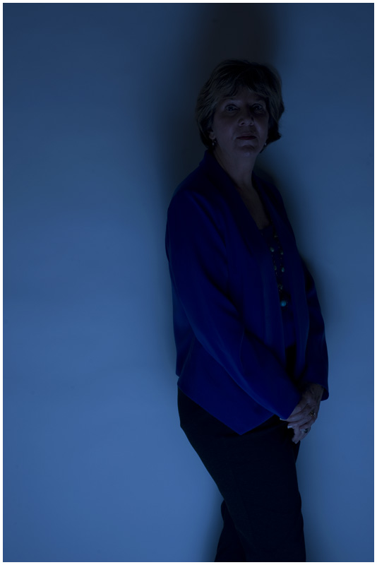
Oh, I think we're pretty much done here. Who even needs a key light with you get this just from the fill?
Laurie, I know you may well be mortified that I am sharing this but … all in the interest of science, right?
So remember, this is fill. But depending on the kind of photo you are going for, you could go a lot of ways from here. Mad scientist? Sure. Just grid her face and be done with it. Or maybe splash some other gridded colors around in there, too.
And you'd need the grids to keep the other lights from contaminating the blue field you have set up. But I am not gonna grid my key because I want it to erase a lot of that blue and just leave it in the shadows.
In fact, even the shadows will ultimately be a less intense blue. That's because my key (which I will warm up with my standard ¼ CTO warming gel) will bounce around in the environment and negate a lot of that blue even in the shadows.
Here's the setup, from the camera position, shot with a wide:

My key is a LumiQuest SB-III, one of my very favorite small-flash mods for portraiture. It can range from hard to soft, depending on how close you bring it in. (We are going a little hard here, but you can totally make this little thing look soft.)
So basically we have taken a living room, stripped it to bare white, killed the ambient and replaced with with a blue upwash of light. Then we hard-lit her against that with warmed-up downlight.
Sounds like a lot, but it's really not. It's just a very granular breakdown of the methodology that you can use to turn anything into, well, anything.

Also, look at the difference between the body language and the expression. The first says, "Trust me, I'm a professional." The second says something more along the lines of, "If you don't read this article/profile, you could miss something good."
A living room, a half-roll of white, some gaff and a couple of speedlights. That's all you need to go in any of a number of different directions. Which is kinda what makes this lighting stuff so fun in the first place.
Next: Lunch Lady Land
__________
New to Strobist? Start here | Or jump right to Lighting 101
Now available in audiobook: The Traveling Photograher's Manifesto
Permalink
<< Home