
On Assignment: The Light You Don't See
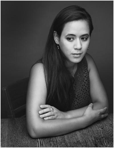
This photo is 100% flash, 0% ambient. But it almost looks like the reverse. And for this portrait of soprano Robin Steitz, a timeless available-light look was what we were going for.
But when you are working with flash (a single speedlight) and controlling your light (a scrounged "fill blanket" from the couch) you can keep the best of both worlds of strobe and ambient.
Knock it Down, Build it Back Up
The first thing we did was to get rid of everything that we didn't want. In this case, our available light and everything in the background.
Robin sat at our dining room table, is a ~100 yr old oak farm table. As such, it has a great patina and texture. And it creates a wonderful, simple environment for a portrait.
But the background—a hall and a front door with windows—is distracting. So that went away first. Using a C-stand and arm, I hung a roll of 53"-wide Thunder Gray background paper. Thunder Gray has long been my favorite background paper for portraits—be they in color or B&W. It's a versatile, deep neutral tone that you can do a lot with.
And today, it takes my visually cluttered hall and turns it into... nothing. Maybe a wall? It just kinda disappears. Background solved.

Now, let's kill the ambient. Going to ISO 200 and my max sync speed (a rather slow 1/180th of a sec) on my Fuji X-E2 and kit zoom, I dialed down my aperture down to f/6.4. Which finished off my ambient light. Nice and black.
The kit zoom is plenty sharp wide open (love that lens) but as a bonus will be even better in the middle of the aperture range. Most lenses are.
So as of now we have a distilled blank slate. A background that disappears, and an ambient exposure that is pure black. Let's build from there.
I'm shooting black and white to make a quieter, more timeless photo. Something that could easily have been done in the 1970's with a 35mm camera and a roll of Tri-X. And that is one of my favorite things about my Fujis. As well as they do color, their black and white looks like film right out of camera.
Even better: turn on the built-in yellow filter setting (red is a bit much for me) and tweak the contrast curves (in camera) until the the B&W look is what you want. To an old-timer like me, it feels a lot like watching a print come up in the Dektol.
__________
Let's Bring in Some Light

We're gonna light this with a single speedlight (an LP-180) and my favorite go-to soft mod (a 60" Photek SoftLighter II).
Using a second C-Stand and arm, the soft light source is floated top and center in front of Robin. And this is where perception meets reality.
What you want: soft light bathing her from all around. Control over the shadows. A light that disappears.
What you get: Soft light, but deep shadows. It's soft, but it definitely looks "lit," which ruins the feel of an available light B&W photo.
Here's the problem. That oak table is very dark, and is giving nothing back to the shadows. We need a big fill card... [looks around the living room] or... a white fill blanket.
That'll help.
But it didn't help. It just wasn't getting enough energy from that flash, even though I had placed it on the table as close as possible—just out of the bottom of the frame.
It was still all key light. Too much key, not enough fill.
But we can solve both of those problems at one time by literally taking the light off of Robin, and pushing it down into the fill blanket. (Don't laugh. I have used weirder things for fill.)

And that was all it took. Not only do we get a better ratio, but we get total control over the ratio. The more you pull the light away from Robin (and push it down into the fill) the more the key light drops and the fill light rises.

Yes, you are losing key light on your subject. But all you have to do to get the exposure back is to power up your strobe a little. No prob.
Think of that light from the perspective of Robin's face. It's sort of a top/bottom clamshell, but not in the traditional beauty light sense. It's more of a zone of top/bottom light that has a boundary to it. And she is emerging into the edge of it.
So the light pushes into her features without really calling attention to itself. It is not even leaving a signature in her eyes.
And that makes it look not lit. Even though it totally, 100% is lit.
Which in turn makes it look even more like something made out of ambient light and Tri-X, back in the day.
__________
On Assignment: The Light You Don't See is #170 in the long-running On Assignment series, which can be found here.
NEXT: On Assignment: Studio in the Wild
__________
New to Strobist? Start here | Or jump right to Lighting 101
Now available in audiobook: The Traveling Photograher's Manifesto
Permalink
<< Home