
Lighting 102: Controlling Specular Highlights
Abstract: Manipulating the reflection of a light source is an underused-but-effective tool.
We have all had to deal with specular highlights, even if we did not know what they were called.
Think about portraits of people you have made in direct sunlight. Remember that glaring spot on their face or forehead? That was the specular highlight of the sun. And if the person was sweating or had oily skin it only made matters worse, as that sheen is very efficient at throwing back a hard specular.
That reflection is a function of the intensity of the light source. More specifically, think of it as intensity per square inch. And understanding this starts to tell us how to control it.
Think of your subject as a complex shaped mirror. If you light them with, for example, a bare flash you are going to get a tiny, super bright reflection thrown back at you. Maybe more than one.
That's because all of that light is coming from a source that is, what, two square inches? That is a lot of intensity per square inch. And it will show, in a very hard specular.
And remember, that specular is another highlight—above and beyond the diffused highlight, or true tonality of the subject. So a specular will be much more extreme on someone with dark skin than it would on someone with light skin. This is because there is a greater range between the true tonality of the subject and the tone of the specular.
Is there anything we can do to change that? Yep, there is. First, we can raise the value of the shadows. Then we can lower the value of the speculars. And in doing so, we can make our contrast range pretty much anything we want.
Compressing the Zones
Let's back up and remember the zones of light on a face in a portrait. Specifically, three of the four zones: shadow, diffused highlight and specular highlight.
The diffused highlight is set. There is only one exposure that will give you the correct tone of the face. You can't really change that, as it would also change brightness of the other subject matter in the photo.
For instance, what if your subject was dark-skinned and showed up wearing a white shirt? You should know how to handle that without just cranking up the exposure, shooting in RAW, spending a needless evening in Photoshop and then crying yourself to sleep because you are not a real photographer.
What we really need to do is to compress and control the contrast range of the photo, especially on her face. So let's start with something we already understand: raising the shadows. The idea of a fill/legibility light is going to help us a lot here.
So let's start with a big umbrella right behind the camera and fill her from straight on. I'll set the ratio tight — maybe fill her to just one stop below my final exposure. This will bring the shadows up and compress the tonal range from the bottom.
And using a big umbrella (or a normal one, in closer) will also do something else for me. Remember our pinpoint, bright bare flash as a light source? All that light, spread out over only two square inches?
Well, even in a 43" umbrella, that same light is going to be distributed over a total area of over 1500 square inches. And it will become correspondingly dimmer per square inch. Like, about 700 times dimmer. And here, I am using a 60" umbrella, which makes is even less intense per square inch.
Which means that every square inch of that light source's reflection on the subject (oops, I mean specular highlight) will be smooth and creamy.
So by both lifting my shadows and lowering the value of my specular, I can easily compress the tonal range of the photo to make everthing fit. And I can do it at the right exposure for her face.
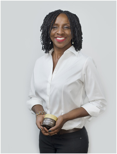
Here's the lighting setup. It might be a little complex for you at this point (four lights) but you can basically ignore the side umbrellas. They are lighting the background and wrapping her a bit. She looks a little more three-dimensional because of them, but they are not affecting her face.
This photo is really all about the big umbrella at the far right of the frame, and the top/key light at center left of the frame. The big one is my fill light, creating a very high base exposure for any shadows cast by my key. Then the key light comes in and fully lights her face.
But they both are big, creamy light sources that take the specular highlight and spread it out — also making it less intense. Let's take a closer look:
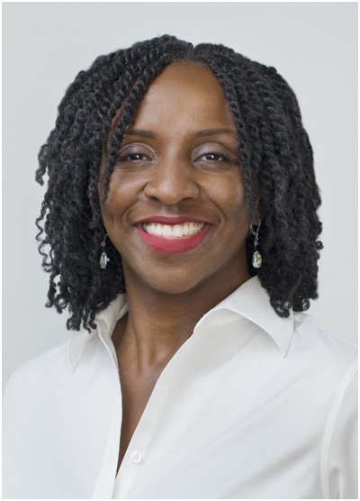
Normally, we think of a face as being defined by light and shadow, right? But here, the shadows are basically gone. The fill is right on axis with the camera. And it is set to a very high fill ratio, down one stop from the key light.
Meaning, if she is lit by the key light to, say, f/11, then the fill light is lighting her to f/8. So if I took away the key light, she would still be almost fully exposed by the fill light. That's what we mean by a tight, or compressed, lighting ratio.
You can tell this by looking at how lifted the shadows are on her shirt. Actually, I don't even think there is a full stop of difference between the highlight and shadows. Maybe two thirds of a stop. The point is, it's a tight lighting ratio.
The distribution of lifted shadows and big, muted specular highlights from the large light sources really changes the contrast range on her face. Instead of her face having the range of shadow to diffused highlight to specular highlight, it now basically has the range of diffused highlight to (big, muted) specular highlight.
I am really controlling the size and intensity and placement of that specular by how close my lights are, how big they are, and the angle of attack. (The latter determines where the specular will be, which will shape her face in lieu of the typical shadow vs. highlight thing.)
What? You don't believe her face shape is now all about diffused highlight vs. specular? Let's outline the specular highlights to make them more obvious:
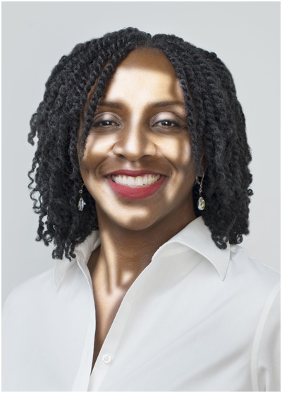
All of the areas I just selected in Photoshop are really specular highlights. Those thin stripes, nearly bisecting her eyes? Those are actually reflections, within the specular highlight, of her hair.
Now, take a moment to go back to the un-outlined version and see how it really is the specular that is definining her face. Big, muted speculars that I controlled. And in doing so, I fixed any contrast issues that might have arisen.
By working with the range of diffused highlight to specular highlight, I shifted the range of tones in the photo using only the shape of my lighting.
The lady in the photo, BTW, is Funlayo Alabi. She is very cool and doing some neat things. You can learn more (and see more about the shoot) in the On Assignment post from which these photos were drawn.
Product Shot, Same Principle
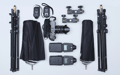
Here's a shot of my (then) two-speedlight kit, circa 2016. That's eleven different items, all black, on white paper.
You can't just overexpose your way to surface detail on this, because you'll blow away your whites. And to make matters worse, many of the objects have bright shiny parts, too.
The solution: two bare speedlights, pointed straight up to the ceiling. ("Yo, I heard you like two-light kits. So I shot your two-light kit with a two-light kit.")
In this case, I wanted a nice big, creamy light source to create big, soft specular highlights. By aiming my speedlights upwards, my smooth white ceiling became a gorgeous, big light source.
Each of those big, soft highlights in this photo is simply a reflection of my ceiling awash in the light from my two flashes. Click on the photo to see it big, and this becomes pretty obvious.
Good lighting is not about throwing money at the problem. It is about knowing the effect you want — and understanding how to get it.
__________
And Now, Back to Dean
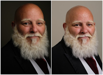
Remember that side-by-side comparison from a couple of posts back? See anything else different in these two photos?
Look at the difference in the specular highlights between the two — especially at his nose. When the umbrella is in very close, the specular highlight is bigger, and way more muted.
That's because from the perspective of the surface of Dean's face, the close-in light looks bigger. And since it is the same total amount of light, each square inch of the light source appears to contain less intensity.
Move it back and the light source appears smaller. Same total light (we adjusted the power output, remember?) so the smaller umbrella looks more intense per square inch.
One is shiny—we need some makeup before the shot, or some Photoshop after.
The other is buttery smooth, right out of the camera. Same exact light source.
At Least Remember This
I realize this is a lot to throw at you. But the important thing in the last couple of posts is that by knowing and understanding the different zones of light as expressed by your subject, you can learn to solve any lighting problem that might present itself.
I'm not throwing this shoot out for you to copy. (Or you can—I don't care.) But rather, to show you the process of learning to understand what the real lighting challenge is, and a pathway to solving it.
A fundamental understanding of how light affects your subject is really helpful when things start to go offscript. Also, it will give you the tools to create — in camera — pretty much any lighting look you can see with your mind's eye.
__________
Next: Side Effects
We have all had to deal with specular highlights, even if we did not know what they were called.
Think about portraits of people you have made in direct sunlight. Remember that glaring spot on their face or forehead? That was the specular highlight of the sun. And if the person was sweating or had oily skin it only made matters worse, as that sheen is very efficient at throwing back a hard specular.
That reflection is a function of the intensity of the light source. More specifically, think of it as intensity per square inch. And understanding this starts to tell us how to control it.
Think of your subject as a complex shaped mirror. If you light them with, for example, a bare flash you are going to get a tiny, super bright reflection thrown back at you. Maybe more than one.
That's because all of that light is coming from a source that is, what, two square inches? That is a lot of intensity per square inch. And it will show, in a very hard specular.
And remember, that specular is another highlight—above and beyond the diffused highlight, or true tonality of the subject. So a specular will be much more extreme on someone with dark skin than it would on someone with light skin. This is because there is a greater range between the true tonality of the subject and the tone of the specular.
Is there anything we can do to change that? Yep, there is. First, we can raise the value of the shadows. Then we can lower the value of the speculars. And in doing so, we can make our contrast range pretty much anything we want.
Compressing the Zones
Let's back up and remember the zones of light on a face in a portrait. Specifically, three of the four zones: shadow, diffused highlight and specular highlight.
The diffused highlight is set. There is only one exposure that will give you the correct tone of the face. You can't really change that, as it would also change brightness of the other subject matter in the photo.
For instance, what if your subject was dark-skinned and showed up wearing a white shirt? You should know how to handle that without just cranking up the exposure, shooting in RAW, spending a needless evening in Photoshop and then crying yourself to sleep because you are not a real photographer.
What we really need to do is to compress and control the contrast range of the photo, especially on her face. So let's start with something we already understand: raising the shadows. The idea of a fill/legibility light is going to help us a lot here.
So let's start with a big umbrella right behind the camera and fill her from straight on. I'll set the ratio tight — maybe fill her to just one stop below my final exposure. This will bring the shadows up and compress the tonal range from the bottom.
And using a big umbrella (or a normal one, in closer) will also do something else for me. Remember our pinpoint, bright bare flash as a light source? All that light, spread out over only two square inches?
Well, even in a 43" umbrella, that same light is going to be distributed over a total area of over 1500 square inches. And it will become correspondingly dimmer per square inch. Like, about 700 times dimmer. And here, I am using a 60" umbrella, which makes is even less intense per square inch.
Which means that every square inch of that light source's reflection on the subject (oops, I mean specular highlight) will be smooth and creamy.
So by both lifting my shadows and lowering the value of my specular, I can easily compress the tonal range of the photo to make everthing fit. And I can do it at the right exposure for her face.

Here's the lighting setup. It might be a little complex for you at this point (four lights) but you can basically ignore the side umbrellas. They are lighting the background and wrapping her a bit. She looks a little more three-dimensional because of them, but they are not affecting her face.
This photo is really all about the big umbrella at the far right of the frame, and the top/key light at center left of the frame. The big one is my fill light, creating a very high base exposure for any shadows cast by my key. Then the key light comes in and fully lights her face.
But they both are big, creamy light sources that take the specular highlight and spread it out — also making it less intense. Let's take a closer look:
Normally, we think of a face as being defined by light and shadow, right? But here, the shadows are basically gone. The fill is right on axis with the camera. And it is set to a very high fill ratio, down one stop from the key light.
Meaning, if she is lit by the key light to, say, f/11, then the fill light is lighting her to f/8. So if I took away the key light, she would still be almost fully exposed by the fill light. That's what we mean by a tight, or compressed, lighting ratio.
You can tell this by looking at how lifted the shadows are on her shirt. Actually, I don't even think there is a full stop of difference between the highlight and shadows. Maybe two thirds of a stop. The point is, it's a tight lighting ratio.
The distribution of lifted shadows and big, muted specular highlights from the large light sources really changes the contrast range on her face. Instead of her face having the range of shadow to diffused highlight to specular highlight, it now basically has the range of diffused highlight to (big, muted) specular highlight.
I am really controlling the size and intensity and placement of that specular by how close my lights are, how big they are, and the angle of attack. (The latter determines where the specular will be, which will shape her face in lieu of the typical shadow vs. highlight thing.)
What? You don't believe her face shape is now all about diffused highlight vs. specular? Let's outline the specular highlights to make them more obvious:
All of the areas I just selected in Photoshop are really specular highlights. Those thin stripes, nearly bisecting her eyes? Those are actually reflections, within the specular highlight, of her hair.
Now, take a moment to go back to the un-outlined version and see how it really is the specular that is definining her face. Big, muted speculars that I controlled. And in doing so, I fixed any contrast issues that might have arisen.
By working with the range of diffused highlight to specular highlight, I shifted the range of tones in the photo using only the shape of my lighting.
The lady in the photo, BTW, is Funlayo Alabi. She is very cool and doing some neat things. You can learn more (and see more about the shoot) in the On Assignment post from which these photos were drawn.
Product Shot, Same Principle

Here's a shot of my (then) two-speedlight kit, circa 2016. That's eleven different items, all black, on white paper.
You can't just overexpose your way to surface detail on this, because you'll blow away your whites. And to make matters worse, many of the objects have bright shiny parts, too.
The solution: two bare speedlights, pointed straight up to the ceiling. ("Yo, I heard you like two-light kits. So I shot your two-light kit with a two-light kit.")
In this case, I wanted a nice big, creamy light source to create big, soft specular highlights. By aiming my speedlights upwards, my smooth white ceiling became a gorgeous, big light source.
Each of those big, soft highlights in this photo is simply a reflection of my ceiling awash in the light from my two flashes. Click on the photo to see it big, and this becomes pretty obvious.
Good lighting is not about throwing money at the problem. It is about knowing the effect you want — and understanding how to get it.
__________
And Now, Back to Dean

Remember that side-by-side comparison from a couple of posts back? See anything else different in these two photos?
Look at the difference in the specular highlights between the two — especially at his nose. When the umbrella is in very close, the specular highlight is bigger, and way more muted.
That's because from the perspective of the surface of Dean's face, the close-in light looks bigger. And since it is the same total amount of light, each square inch of the light source appears to contain less intensity.
Move it back and the light source appears smaller. Same total light (we adjusted the power output, remember?) so the smaller umbrella looks more intense per square inch.
One is shiny—we need some makeup before the shot, or some Photoshop after.
The other is buttery smooth, right out of the camera. Same exact light source.
At Least Remember This
I realize this is a lot to throw at you. But the important thing in the last couple of posts is that by knowing and understanding the different zones of light as expressed by your subject, you can learn to solve any lighting problem that might present itself.
I'm not throwing this shoot out for you to copy. (Or you can—I don't care.) But rather, to show you the process of learning to understand what the real lighting challenge is, and a pathway to solving it.
A fundamental understanding of how light affects your subject is really helpful when things start to go offscript. Also, it will give you the tools to create — in camera — pretty much any lighting look you can see with your mind's eye.
__________
Next: Side Effects
__________
New to Strobist? Start here | Or jump right to Lighting 101
Now available in audiobook: The Traveling Photograher's Manifesto
Permalink
<< Home