Lighting 102: Distance

Just like your focus, light has depth of field.
For this layer of control, we are going to look at two different pictures. Everything will be the same except for one thing: The distance from our light to our subject will change. Nothing else. In particular, the subject-to-background distance will not change.
Exhibit number one is a dark portrait of Dean, situated a few feet in front of a white wall, pictured above.
White wall? Yes, white. But it doesn't look white, does it?
Nope. That's because the light is very close to Dean—maybe a foot and a half away. And then Dean, in turn, is about six feet away from the wall.

Here's a pullback shot. As you can see, I am basically jamming that light into his face. (I do that a lot.)
So the light has to go about five times as far to get to the wall as it does to get to Dean. During that distance, the intensity the light decreases substantially. You will sometimes hear this referred to as the Inverse Square Law. But that is needlessly obtuse and mathematical.
Just remember this: the closer a light is, the faster it falls off.

Come to think of it, that's not a bad framing for him, either. Let's stick that one in the keeper pile, while we are editing. But notice the white wall to his camera left side. It's pretty dark, too. Again, relative to Dean it is pretty far from the flash. So you won't get much kickback/shadow filling from that side wall, either.
Result: one dark, moody portrait.
Let's move our light back from Dean, adjust the power setting on the flash to compensate for the extra distance, and shoot another one.

Oh, look. There's our white wall. Okay, not white, but getting lighter. I could move the light further back—or move dean and the light closer to the back wall—and make that wall pretty much any tone between white and black that I wanted.
In this example, the two working distances—light to Dean, and light to back wall—are relatively close to each other. So, the wall is getting an amount of light that is closer to what Dean is getting. And it looks lighter as a result.

Here's a pullback. Because the umbrella is further away, I used a wider shot. So maybe it looks like Dean is a tad closer to the back wall. But I assure you that he is standing in the exact same place.
Also, look how much relatively brighter the wall at camera left is. Same reason—light to Dean, vs light to side wall distances. But the result is, it also throws back more fill light to Dean's shadow side.
Holy crap, that's a lot of control for a single light and a simple white-walled corner for a headshot, right?
Damn right it is.
Light has depth of field. The closer it is, the faster it falls off. The further away it is, the slower it falls off. Or put differently: the further away a lght is, the more evenly you can light something.
__________
A Real-World Test
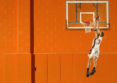
What if, say, you wanted to light, say, the full length of a basketball player and the back wall of a gym with one speedlight. And what if you wanted to do it evenly? Could you?
Yep:

You can see more about how that was done, here. But you already know the important part: we had to move that light waaaay back.
__________
EXERCISE:
Find a white-walled corner and a helpless victim to photograph, using a single flash and umbrella. Make sure you set your f/stop and shutter speed to ensure that only the flash is affecting the exposure.
As above, experiment with the three distances (flash to subject, flash to back wall, flash to side wall) to get a variety of different bqackground tones and side-fill levels.
Hint: make sure raw light is not spilling past the edges of your umbrella onto the back wall.
Next: Using Distance to Create Tiered Light
__________
New to Strobist? Start here | Or jump right to Lighting 101
Now available in audiobook: The Traveling Photograher's Manifesto
Permalink

<< Home