On Assignment: Hi-Def Asparagus

If you ever get to Barcelona, you owe it to yourself to go to the Picasso Museum. I never really understood the guy's work until I visited there in 1996. I wish every major artist had a museum like Pablo's.
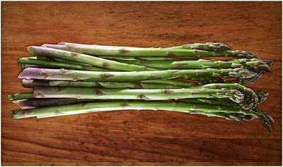
As a photographer, it resonated with me because it was all about finding your style. Which, by the way, is exactly how the Picasso Museum relates to the asparagus photo above.
____________
The museum is laid out chronologically, and that's the special sauce. By walking through Picasso's work -- in order -- you experience his life as an artist. And during that visit, you watch him try (and usually master) then reject pretty much every significant painting style that pre-existed him before finally settling on his own. All you can do as a photographer is to watch, slack-jawed, as the transformation happens.
You could do a lot worse as a role model. And I have long-adopted that process as a photographer: Study the styles and techniques of others, then try to adapt/mash-up/evolve things to discover my own style.
That's exactly how my style has evolved with respect to product photography. And now that I have a style (technique?) that I like, I especially enjoy using it on objects where the style might seem a little out of genre.

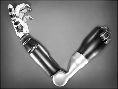
A lot of the products I shoot tend to be either tech or photographic in nature. The arm above, from an editorial shoot (see 'On Assignment' here) is a good example of what I enjoy doing. But I also do a lot of product shots of lighting gear for this blog, mostly because I think many of the canned shots are boring crap.
I first started playing around with lighting individual planes with hard lights when I shot the setup shots for the lunch box post in 2009. I just considered each plane to be its own subject, lit separately. Two years later I use a combination of on-axis and textural edge lighting, done with multiple hard flashes.
This approach highlights both shape and detail, with a combination 2D/3D feel. You can get a pretty wide range of looks depending on how you ratio the on-axis light to the edge lights. (And where you place the edge lights, how many, etc.) Lately, I have been stretching it a little bit out of genre -- including this photo of local asparagus, shot outdoors on location at a farmer's market.
A Little Backstory
I am working on a multi-year project to create a definitive "user's guide," of sorts, for Howard County, MD. I am blogging some of it kinda haphazardly as I go. But ultimately, the full body of info will be recast into a very comprehensive Guide to Howard County.
Hyper-local is very interesting to me right now both because it is what I know and love and because there's a lot of untapped opportunity there. The low-hanging fruit of the web has already been picked. But ultimately, pretty much everything will be online in a cohesive, high-quality format. And done right, these remaining niches will have commercial value. The trick is to find a subject which is photographically interesting to you, is untapped and is of a scale such that you could potentially own that niche as a photographer.
For this project, the goal is to produce an organic, comprehensive, long-lived document that defines Howard County, MD. It will have value for the people who already live here (~250k) who want to better discover their community. But it will also be valuable for those who are considering moving here. Ditto those who are recruiting people to move here. Or selling them houses, etc. You get the idea.
So, what's all of this have to do with asparagus? Not much, except for that the veggie pic will be one of the photos illustrating the locavore/farm-to-table movement that is one of the things that makes HoCo a great place to live. It is just a detail photo. But I am putting a lot of thought and planning into this project, because I want it to rock.
And part of that planning includes a continuity of style across object and/or still life photos. Thus, the techie lighting approach to a pedestrian asparagus detail photo.
Outdoor Studio
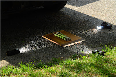
So I shot the veggies at the farmer's market. The markets happen five days a week in HoCo, from May though November. And this particular Wednesday was sunny, so I found some shade in front of a farm truck and went to work on the ground. I exposed for full sun to kill the ambient light in the shade. That gave me total control over the tones when I later added flash.
I had brought a cutting board to use as a backdrop. So I placed it on the ground in the shade, and surrounded the asparagus with three LumoPro LP160 flashes. (Lighting something with bare LP's at this distance at full-sun levels is child's play for them -- probably 1/16th power or so.)

So all of this is happening basically on a similar plane. Everything is pretty two-dimensional, but not totally. And those slight differences are where you create texture. I placed the cutting board on the ground and elevated it with a couple paperbacks so the edge-light flashes could see the asparagus -- but not the cutting board. This was done just by eyeballing the veggies from the position of the flashes laying on the ground. (I had to prop one of the LPs up a little to get the right angle -- using another speedlight to do so.)

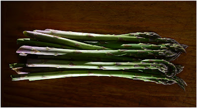
Here is the photo with just the edge lights. It is heavy on shape and light on detail. By bringing in a 4th LP160 (on-axis) in an Orbis, I could dial in the detail to exactly the level I wanted. The level of control is practically anal-retentive.
I stuck the photo up on Flickr a couple weeks ago, and a few people were calling 'Photoshop' right out of the gate. (Um, nope.) Besides, if you think about it, lighting is kinda the 3D version of Photoshop. As of right now at least, Photoshop is still limited to two dimensions. (Give 'em time…)
And granted, it's little trippy because you are taking an object that is pretty 2D and tweaking the light to accentuate the depth. Every physical object is three dimensional. Even objects that appear to be 2D can be lit to bring out depth and texture.
For me, it's a playground. I am looking forward to seeing just where this lighting style takes me. Between the ring and the edge lights, it is kinda like compressing everything to flatness, then extrapolating the edges.
Even thinking of playing with it on some portraits …
__________
Next: Mathieu Young, Moonlighting
__________
New to Strobist? Start here | Or jump right to Lighting 101
Now available in audiobook: The Traveling Photograher's Manifesto
Permalink

<< Home