
Lighting 103: Avoiding Cross Contamination
Abstract: When complementary-gelled lights are falling on the same plane, they can easily rob each other of color. So it is important to make sure your lights are hitting different areas, with minimal overlap.
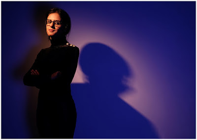
Above is a two-speedlight portrait against a white wall. White walls are the natural enemy of a gel, and practically live to wash out your color. Especially when using two flashes with dense, complementary gels. Knowing how to keep your multi-colored lights operating on different planes will help you retain more saturated color.
Let's walk through the portrait above to get a better look at how our two lights are working separately—and together—in a variety of ways.
__________
Earlier this year I did a "fishbowl" shoot at Gulf Photo Plus in Dubai. The idea was to brainstorm and experiment with different speedlight-based lighting techniques, realtime, in front of a group of people.
What we produced were not developed portraits. It was more like speed dating, but with lighting techniques. (In fact I think I only made a half dozen frames of the shoot above, and that included exposure tests for the lights.)
The point of the photo above is two-fold. One, that you can get fully saturated colors that really pop if you keep the complementary colors from layering atop each other. And two, you can get strong color against a white wall, and even with complementary colors at play in close proximity.
To understand all of the things going on in the different zones of this photo, let's walk through the light starting with that white wall.
Build from the Base
It's good to have a variety of lighting techniques in your pocket for portraits near a white wall. Simply because that is a background that will often present itself—especially in an office environment. In fact, you can all but count on it.
The first thing I do when shooting against a white wall is to give myself total control. So I'll find an ambient exposure that will make the white wall black. In this case, it was f/11 at 1/180th of a second at ISO 250 with my Fuji X-T1 and kit zoom. To be clear, without flash my ambient exposure would record everything as black. So when I add light, I know the only thing that will affect the exposure is the light from my flashes.
So we placed an umbrella very low and at camera right. It was either as low as it could go in a double-fold umbrella, or on the ground. I can't remember for sure. That flash (an LP180 has a full CTB gel on it, and I am going to use that to light the wall.
That flash is going to be set to give me a significant underexposure. Remember, that wall is white. So fully exposed, it would be white—or in our case, a tepid pale blue. But it is registering as at least a full stop and a half (or more) below medium gray in the final image. So, figure the blue light is at least four stops underexposed.
How do I know that? Well, it's two and a half stops underexposure to get the white wall to medium gray, and I am at least a stop and a half below medium gray on the wall's final exposure. At least. So my blue light, coming from bottom right, is at least four stops underexposed.
What are the settings? How did you choose that?
Dunno. And quickly/easily. I was probably at 1/180th at f/5.6 when I made sure the room was black. Set a low-ish power on the blue fill flash and fire a frame; check the results. The wall is too bright. So I closed down to f/11 and fired another frame. Looks good. Done.
It's all relative. I am just getting in the ballpark wth my darkened ambient exposure, then dialing down the aperture to rob light from my too-bright first flash test. The only thing left will be to manually adjust the power of the key light in a moment to match with blue environment I now already have.
Back to the effect. This light creates a rich, blue environment from the formerly white wall. And my subject is not registering from the blue light because she is at least four stops underexposed by that light. So she would be a silhouette in the absence of another light. And she would be throwing a soft black shadow into the wall behind her at upper camera left. More on that in a minute.
Then Add Your Key
To this deep blue environment I'll add a key light (A Nikon SB-800) with a full CTO gel. Is that a lot of gel? Yep, it is. But we are experimenting here. This is no time to weenie out on color density.
The key light is just out of the frame (i.e., pretty close to the subject) and is fitted with a 20-degree grid. I have grids that fit my SB-800s, which is why I used that flash here. This light is aimed such that the grid-restricted beam does not hit the wall until it reaches the camera right side of the frame. (To do this, we feathered the light away from the wall a bit, rotating the head toward the camera.)
This does a couple of cool things. First, it keeps our upper camera left area a rich blue. Something that will really pop against the subject's face. And note, if this bright CTO'd light hit that deep-blue lit (but very efficient) white wall, the color would wash away.
Second, feathering the light away from the wall creates a spotlight/shadow area that gives a nice graphic quality to the empty space in the composition.
How the Two Mix
Let's walk around the frame and see how these lights are interacting.
First, her face. It is super-warm, and strongly pops against the blue. This is because it is only receiving the full CTO gridded light.
Second, her hands. They are only receiving gridded CTO light. But they are almost out of the beam, so they are very dark.
Third, her primary shadow, center frame. Her shadow is from the CTO'd gridded key light. But that shadow area also can see the CTB umbrella'd light at lower right. So it is blue, instead of black.
Fourth: The edge of the beam of the CTO'd key light, around her primary shadow. I love this area—and especially that magenta gradient that is happening there. I did not expect that, either. Why is that?
The center of the beam, were her face not blocking it by the time it reached the wall, would win out over the underexposed blue and give a warm splash of light right there. But again, she is blocking that part of the beam. So we are left with the fall-off area of the beam on our wall. As it transitions to the edge, the blue increaingly wins out over the red-heavy CTO. And through that transition, it creates a magenta gradient into the blue.
Did I expect that? Nope. This is why you experiment and test.
Fifth, her secondary shadow at upper camera left. This is from the blue light. Which explains why a) it is soft, and b) this area is not blue.
Sixth, the separation of her camera-left shoulder and upper arm against the wall. This is unseen back side of her face, lit by a CTO'd key, becoming a light source and shining against the very close (and efficient) white wall. This is like earthshine—the reason we can see the dark part of a crescent moon.
Did I anticipate this? No, I did not. Do I love it? Yes, I do. Would I take credit for anticipating it on a shoot? Well, I can now, because I have seen this happening during a test. This is why we experiment.
__________
I love the idea that two speedlights and a white wall—anywhere—can get you something like this. We are using saturated colors on our light sources to create a new environment right out of thin air. But those planes are close together, and the colors are complementary. So it is important to position the lights where they do not compete against each other, so they retain maximum color.
NEXT: Using Color to Evoke Time and Place
__________
New to Strobist? Start here | Or jump right to Lighting 101
Now available in audiobook: The Traveling Photograher's Manifesto
Permalink
<< Home