
Lighting 103: Developing a Framework
Abstract: Think about the reasons behind the color of your lights, and your palette will often take care of itself.
When you are placing a light source, it's pretty normal to ask yourself, "What color should this light be?"
If you step back a moment and think, the answer will often present itself. A better question to ask is, "What color would this light be?"
A great example of this approach is the lush and beautiful cinematography in the Netflix series, Marco Polo. It only ran for a couple of seasons, but it is perhaps the best example I have ever seen of a lighting designer being driven by pure and simple logic. And the resulting color palette is both stylized and grounded in reality.
Cinematographer Vanja Černjul was working with a story set in the 13th century. So he knew that in reality, he would only have three light sources: sunlight, moonlight and fire.
Seems simple enough in retrospect, right? But still, that's not a palette. Sunlight has a range of warmth (warmer as the sun gets lower) and, well, what color is moonlight?
They tested a range of gels, and decided on a specific blue-green hue for moonlight. They also tested their individual light sources to find the starting point for each light, and the custom gel pack needed to get to the final chosen color of moonlight.
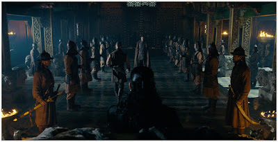
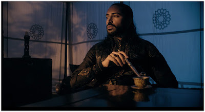
Different combinations of CTO (full cut, double cut, etc.) evoked fire, and round out the trio of colors. The result gave them a look that was both consistent and meaningful. You can see it in throughout the frame grabs included.
I love how they are willing to let the tonal range go very dark at night, both indoors (as seen above) and outdoors, as seen below:
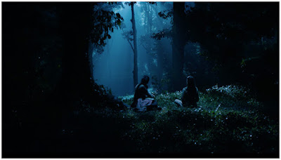
Another trick, a lot of stuff tended to happen on foggy (or rainy) nights. This gives something to catch the "moonlight" and create layers of separation.
Even if it is just fog in the distance, backlight it with your blue-green moonlight and you create separation and detail in the background.
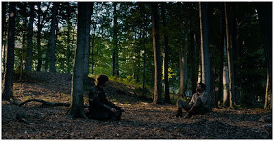
During the daytime, the warmth of the light is driven by how close it is to the horizon. You can see the low, warm sunlight in this afternoon scene:
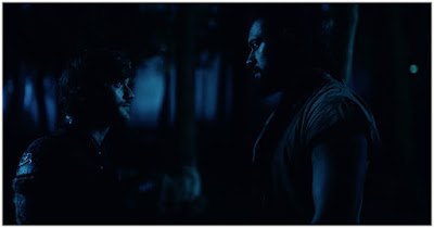
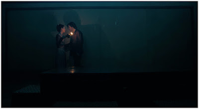
When you go inside at night, you get to use moonlight and firelight to create both color and tonal separation. Outside, a leaf-shaped cookaloris creates a pattern that looks like a torch shining through foliage. The blue fill light establishes night. Together, they establish a time and location on a set that is probably just on an indoor soundstage.
Inside, fire takes over as the key light:
The color contrast built into their palette dictates the approach to all nighttime shots. You can establish moonlight as your underexposed base, and put the fire light source right in the frame, as in this shot:
The lamp light placement is critical here, as it strikes the balance between what is natural and where the key light needs to be. You'd probably never hold a lit lamp right under someone's face like that. But that light need to be there. It is not only lighting the actors but also creating the warm/cool color contrast that brings your eye to them.
I can't be sure, but there might be a CTO'd battery-powered barebulb sticking out in back of the lamp that we can't see. Either way, it is beautifully done.
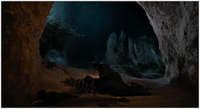
When you only have two colors to use at night, the decisions start to work themselves out: Moonlight coming from back left lights the scene. Oh look, it's raining. The creates some tone and atmosphere when it catches the light.
The camera-right cave wall obviously picks up some moonlight, because of the location of the presumed moon. But the cave's left interior is lit by fire, conveniently hidden by the actors, so you don't get into source/effect intensity conflicts.
If a light source is visible in the frame it needs to be very bright—too bright—to also illuminate the nearby surfaces. So you cheat it by hiding the light source, or using a light source as a practical (like a fire) and then pumping the scene up with some additional double-CTO'd light from a similar direction with a hidden source.
That the hidden fire also separates the actors from the background is icing on the cake. It allows Černjul to keep the scene lush and dark—yet more icing.
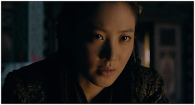
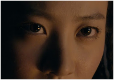
I love to study the close-ups in night shots, as they often reveal hidden light sources in the actors' eyes. In this case you can see three light sources. The key light is a CTO'd (at least) horizontal strip light, oriented for vertical control and horizontal wrap.
The fill/room wash is a moonlight-gelled light shot through a big scrim. And the practical — the fire — is also visible as a third/fill light source:
I love watching beautifully lit motion pictures, as there is always so much to learn. If you have Netflix, I would recommend Marco Polo both for the lighting and for the series itself. The lighting is so masterfully done, it's easy to not notice it at all. But is is worth the effort to do so.
__________
As a bonus, two videos produced by Manhattan Edit Workshop, wherein cinematographer Vanja Černjul talks about the process of building and testing the lighting design for seasons one and two of Marco Polo. This will also give you a feel for the lushness of the series. If you have not seen it, a visual treat awaits.
NEXT: How they use color in live theater

When you are placing a light source, it's pretty normal to ask yourself, "What color should this light be?"
If you step back a moment and think, the answer will often present itself. A better question to ask is, "What color would this light be?"
A great example of this approach is the lush and beautiful cinematography in the Netflix series, Marco Polo. It only ran for a couple of seasons, but it is perhaps the best example I have ever seen of a lighting designer being driven by pure and simple logic. And the resulting color palette is both stylized and grounded in reality.
Cinematographer Vanja Černjul was working with a story set in the 13th century. So he knew that in reality, he would only have three light sources: sunlight, moonlight and fire.
Seems simple enough in retrospect, right? But still, that's not a palette. Sunlight has a range of warmth (warmer as the sun gets lower) and, well, what color is moonlight?
They tested a range of gels, and decided on a specific blue-green hue for moonlight. They also tested their individual light sources to find the starting point for each light, and the custom gel pack needed to get to the final chosen color of moonlight.
Different combinations of CTO (full cut, double cut, etc.) evoked fire, and round out the trio of colors. The result gave them a look that was both consistent and meaningful. You can see it in throughout the frame grabs included.
I love how they are willing to let the tonal range go very dark at night, both indoors (as seen above) and outdoors, as seen below:

Another trick, a lot of stuff tended to happen on foggy (or rainy) nights. This gives something to catch the "moonlight" and create layers of separation.
Even if it is just fog in the distance, backlight it with your blue-green moonlight and you create separation and detail in the background.

During the daytime, the warmth of the light is driven by how close it is to the horizon. You can see the low, warm sunlight in this afternoon scene:

When you go inside at night, you get to use moonlight and firelight to create both color and tonal separation. Outside, a leaf-shaped cookaloris creates a pattern that looks like a torch shining through foliage. The blue fill light establishes night. Together, they establish a time and location on a set that is probably just on an indoor soundstage.
Inside, fire takes over as the key light:

The color contrast built into their palette dictates the approach to all nighttime shots. You can establish moonlight as your underexposed base, and put the fire light source right in the frame, as in this shot:

The lamp light placement is critical here, as it strikes the balance between what is natural and where the key light needs to be. You'd probably never hold a lit lamp right under someone's face like that. But that light need to be there. It is not only lighting the actors but also creating the warm/cool color contrast that brings your eye to them.
I can't be sure, but there might be a CTO'd battery-powered barebulb sticking out in back of the lamp that we can't see. Either way, it is beautifully done.

When you only have two colors to use at night, the decisions start to work themselves out: Moonlight coming from back left lights the scene. Oh look, it's raining. The creates some tone and atmosphere when it catches the light.
The camera-right cave wall obviously picks up some moonlight, because of the location of the presumed moon. But the cave's left interior is lit by fire, conveniently hidden by the actors, so you don't get into source/effect intensity conflicts.
If a light source is visible in the frame it needs to be very bright—too bright—to also illuminate the nearby surfaces. So you cheat it by hiding the light source, or using a light source as a practical (like a fire) and then pumping the scene up with some additional double-CTO'd light from a similar direction with a hidden source.
That the hidden fire also separates the actors from the background is icing on the cake. It allows Černjul to keep the scene lush and dark—yet more icing.

I love to study the close-ups in night shots, as they often reveal hidden light sources in the actors' eyes. In this case you can see three light sources. The key light is a CTO'd (at least) horizontal strip light, oriented for vertical control and horizontal wrap.
The fill/room wash is a moonlight-gelled light shot through a big scrim. And the practical — the fire — is also visible as a third/fill light source:

I love watching beautifully lit motion pictures, as there is always so much to learn. If you have Netflix, I would recommend Marco Polo both for the lighting and for the series itself. The lighting is so masterfully done, it's easy to not notice it at all. But is is worth the effort to do so.
__________
As a bonus, two videos produced by Manhattan Edit Workshop, wherein cinematographer Vanja Černjul talks about the process of building and testing the lighting design for seasons one and two of Marco Polo. This will also give you a feel for the lushness of the series. If you have not seen it, a visual treat awaits.
NEXT: How they use color in live theater
__________
New to Strobist? Start here | Or jump right to Lighting 101
Now available in audiobook: The Traveling Photograher's Manifesto
Permalink
<< Home