
Lighting 103: How Designers Gel Live Performances
Abstract: A dynamic, 3-D scene and hundreds of sources—a talk with a theatrical lighting designer
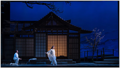
Photo © Lucas Krech
Today in Lighting 103, a little side trip. Fair warning: we are taking a bit of a deep dive. For some of you this will make your eyes glaze over. But for others, it'll be a very cool look into the way live performance lighting designers think with respect to color.
No worries; we'll be back in the center of the bell curve in the next installment.
A Chat with a Lighting Designer
New York-based Lucas Krech is a lighting designer who works with operas, dances, plays and performance pieces. He is also is a photographer, which is how we originally intersected via Twitter.
A ways back, I wrote to him to find out a little more about how people approach the process of lighting live performances. What I got back was basically a firehose/brain dump that gave me a fascinating look into how he thinks.
It felt a little too info-dense to just drop in as a stand-alone post without proper context. I'm not in the busness of trying to scare people off. But as we were just making an L103 detour into the use of color in TV and cinema, I thought this might be the best place to put it.
As for the material, it is kinda like I was eavesdropping on a late-night conversation between lighting guys at a bar in the Theatre District in NYC. The kind of thing where you'd definitely try to grab a stool within earshot and take in as much as you can.
For the sake of this not becoming a giant blob of gray text, I've also included (with permission) some of the photos Lucas took of his work on Madama Butterfly at Opera Colorado in Denver. You can see more images from that opera here, and more examples of Lucas' live performance work, here.
With that, let's join him mid-stream and eavesdrop at the bar. From here on, it's all Lucas talking...
"Lighting a set right is the difference between community theater and Broadway."
For a sense of scale most photographers start getting overwhelmed by three zones of control and much more than three lights. For the Lincoln Center gig I've got around 500 lights, 30 of which are automated fixtures that can reposition, color change, project patterns and movement, etc. all controlled by a computer lighting console. The tour is much smaller(as it all needs to fit in a 25' truck) so we only have a few dozen lights in that rig but all automated fixture.
So where do I start with light on a project? Since most of my work is in dramatic storytelling (opera, theater, dance) I have to consider the where, when, and why of place as much as of person. In photography we could translate that into environmental portraiture perhaps. Live performance is inherently collaborative. We are working with not just the performers, but scenic designers, costume and makeup designers, video, etc. Part of the lighting designer's job is to not only bring their vision to the table, but to make all their other collaborators work look good. Lighting a set right is the difference between community theater and Broadway. A poorly lit performer is harder for the audience to believe. Costumes and makeup can be made or ruined by the light and color put on them. Video can be washed out if the stage is improperly lit.
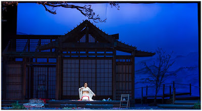
Photo © Lucas Krech
So let's begin. Say you have a nighttime scene. Is night blue or is night dark? Is it the beautiful moonlit night of the balcony scene in Romeo and Juliet where every shadow should be filled with rich hints of color or are we watching MacBeth follow the knife into the King's bed chamber stark and dark? They are both night but each one has a radically different sense of shadow. And light is only ever defined by shadow. So that can be a starting point.
OK, we have night and it is blue and romantic, because we are lighting Romeo and Juliet, and we have a moon. And moonlight is white. So now we are getting into theory because a white light does not mean an unfiltered source. We white balance for the eye just like we do for a camera. If I use a deep blue for my ambient night, say L119 I have to think very hard about what sort of white that moon should be. The L119 is blue and it has a hint of green in it, but not so much that you can't also pull out a rich warmth if you start dimming it. Something like L161, a pale blue with a good jolt of green is going to cut through that dark blue with a crisp sharpness to it allowing you to get great highlights when used as a sidelight or diagonal back (kicker in photography lingo).
Well we probably need a bit of facelight too and the audience is paying to see these actors so now we veer into tints and color correction. Blue again so everything blends, perhaps a full CTB (because we are using tungsten sources). OK L201 or R3202? Remember, the moon is our source so we do not want our facelight to overpower it. Rather we just want to bring out enough features that we can see our lovely couple clearly. L201 is shifted slightly green while R3202 is slightly red. Warm blues tend to be recessive while cool blues are dominant so by using the R3202 we can bring light onto a face without it taking over the scene.
"Color is often where we distinguish hard vs. soft light"
In fact for live performance, where we only use hard sources, color is often where we distinguish hard vs. soft light. Want a sharp edge, pick a dominant color like green or magenta. Want your light to just emerge out of nowhere, pick a recessive color like lavender. And all of that is relative which is where thinking through what CTB to use can gain you a lot of ground. But this is a fine grained detail only possible because the resolution of the human eye is so many orders of magnitude greater than the best camera sensor or film. On camera the R3202 or L201 are nearly identical.
So just like for the balcony scene I would follow that process through each scene of a play or opera or dance. And that is more or less the design process. Most of this is figured out well ahead of ever getting to the venue. Using old school paper and pencil to do very precise worksheeting I will figure out the angles and then drop in my color. Once I get to the venue, which can be many weeks after the lightplot is due, I need to focus on composition and there often isn't enough time to move a bunch of lights around. Being able to know exactly what your light is going to do when you turn it on is critical. For a world premier 12 minute dance I might be lucky if I get half an hour to light it. That's enough time to build lighting cues in real time as they dance it, do a couple quick notes, and run it again adjusting as they dance. And done. On to lighting the next piece. Next time I see that lighting there is an audience of 3000 people.
If you are wondering what a particular color or angle of light is going to do you've already lost your chance to light the piece. You need to know your light before you turn it on. At least that is the American way. I've worked with European and Canadian choreographers who are shocked, SHOCKED, at how little time there is to light their piece. I love European design for its very slow and considered approach, we never get that in this country. But in more ways than one Americans are fast and scrappy to both our benefit and detriment.
"Just as a single 8' Octa box might have four or six speedlights in it, we do a similar thing in stage lighting."
So 500 lights is a big show. A much more typical sized opera or dance project would be between 100-300 lights. But remember that this is the total number of fixtures. Just as a single 8' Octa box might have four or six speedlights in it, we do a similar thing in stage lighting. That R3202 frontlight needs to cover the entire stage. The stage might be 40' wide by 25' deep or bigger. So you divide the stage into areas. Perhaps 5 across and four deep. Now each of those areas needs a light. Each area actually needs several lights. So we might have 20 lights all colored R3202 coming from the front in order to give us that recessive facelight. I would also want a warm light from that same position, perhaps clear incandescent. Then sidelights in cool and warm. Backlights in cool and warm.
A super generic warm/cool lightplot already puts us at 120 fixtures for a moderate sized stage. Then there is all the special stuff just for one setting, scenery washes, special lights for chairs or balconies or staircases (oh my god, staircases take a lot of lights!), color changing fixtures, etc. Three hundred lights ends up needing a lot of stuff that can do double and triple duty.
Going back to that theoretical Romeo and Juliet, the R3202 may be perfect for the balcony scene but the whole rest of the play from Mercutio's death on is cold and dark. So perhaps L201 is the right color for the facelight and we just spend a little extra effort balancing the intensities of the balcony scene so those lights can work better for the rest of the show. Rinse, lather, repeat. It is an iterative process in terms of both the pre-planning and the actual cueing. Once we are in the theater we start at the top, go through the show and once done go through it again from the top until we run out of time adjusting our cues as they go.
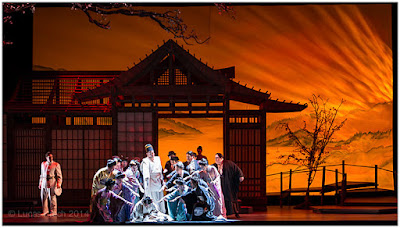
Photo © Lucas Krech
A single scene, or look, might have dozens of cues in it. As the performers move around the stage we are constantly adjusting the lighting to bring focus to where they are and pull focus from where they are not. So stage lighting is more analagous to cinematography than still shooting. The lighting designer is DP and editor in a lot of ways.
Many lights, or lighting ideas, will be reused and recycled, and remixed throughout the course of a show. A painter might put that blue on their palette for the sky, but then they find it also mixes really nicely in the woman's dress and in the shadow blacks. [DH here: Ooh, ooh! I understand what he means by this!]
Designing a lightplot is very much akin to that painterly palette. One way that we can expand that palette is with color changing fixtures. LEDs are coming on line but most lights are either incandescent or discharge sources. You can put a device like a color scroller in front of a light which might allow you 16 or 32 different frames of color that you can digitally scroll through. Some scrollers have three scrolls of variously saturated gel to allow full CMY mixing. So perhaps your sidelight or back light, instead of being a warm and a cool is a clear and a color changer. That's a great way to expand your palette. Automated lighting is another.
Fixtures with full CMY mixing capability are invaluable as well as the ability to reposition through computer control. Rather than focus 100 specials you have a half dozen CMY moving lights and you have special light in whatever color wherever you need it. Because you have no time and computers are faster than even the best stagehand at the Met. Lighting is about time both artistically in terms of mood and literally in terms of getting things done. I am often amazed at what we regularly pull off with no time to do so.
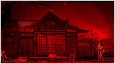
Photo © Lucas Krech
There is a risk with all these color options. Color can be so powerful that you ignore dynamic compositions for a few quick color changes. That is true with photographically too. It may be bold color but a bunch of bananas on a red table cloth is still just a picture of bananas on a table. It's not exactly pushing the envelope.
I love bold color choices, and this rock show I am currently lighting certainly has them. At the same time it is critical to find those quiet subtle moments to let the audience breathe. There is a technical term for that: color fatigue. The human eye always wants to see white light so sit in a room filled with red light long enough and the eye will compensate to see it in white light. Step outside into white light and everything looks Cyan until the eye adjusts again. We can play with that on stage too for impact by flooding the stage with red and then bumping to green.
As much as I love bold color I often to use very controlled palettes in my theatrical work. Photographically too I like black and white or very desaturated b&W/color layered composites. I do plenty of live shows where the entire color range is Full CTB to 1/4 CTB on incandescent lights. And photographically too, gelling my speedlights no further than 1/2 CTO (balancing for strobe). It may seem limiting at first but if you go deep into color theory it can be amazingly freeing and really fun.
Basic color theory runs that complementary colors create dynamic contrast. Red and green. Boom! But that same theory works on a subtle level as well as it does on a gross level. L201 and R3202 are both full CTB. One is red shifted and one is green shifted. Put the green shifted as your backlight (dominant color from a dominant angle) and your red shifted as your frontlight (recessive color from a recessive angle) and suddenly the most boring two light setup possible has a strong dynamism to it and we are still living in a white light world. Not clear light, white light.
"Living in a white light world but creating subtle dynamic images"
The same works with strobes. Take your unfiltered speedlight and balance that to white. Then play around with 1/8, 1/4, 1/2, and Full CTO and CTS. Same thing. They are both amber but amber is a combination of red and green light. The CTO is red shifted and the CTS green shifted. [DH here: I did not know this.]
So you are living in a white light world but creating subtle dynamic images. You get huge color ranges to play with just going between CTO, CTS, and CTB without ever delving in to chromatic color ranges. Rosco's CalColors® are really nice as they have developed a very precise system for chromatic colors much like color correction. So you can mix 1/2 red with 1/4 red rather than fussing around a bunch of gells all shifted in slightly different directions.
It's easy to take L106 (primary red) and R90 (primary green) and make a striking look. But it is heavy handed and garish and only works in limited contexts. But if you understand the theory you can work down to a level of tints that the common audience member can't even detect but that they can feel on a subconscious level. I think the same is true in camera.
I get teased a fair bit because of my love of color and color theory and that much of my work often gets characterized as "white light" design. And my photography is primarily black and white, or very desaturated. But for me that's where the fun resides. Primary blue and primary yellow are complementary colors. But so too are L201 and clear incandescent (which is a lot more subtie live than in-camera).
I've had two huge influences on my own photography from my entertainment work. The first is a sense of theatricality and storytelling. In my street photography I am always looking for a set or a story. Sometimes very abstract but always a story. A fragment of a 100 year old storefront sign or a decaying building that looks like some amazing opera might happen as soon as someone steps through the doorway. The second influence is a love of hard light and hard shadows.
__________
First of all, a big thanks to Lucas for a lot of layered information on how theatrial lighting designers think. I doubt I'll ever get the opportunity to light a live production, but the color theory stuff is fantastic and very helpful. I have read through this several times, and am still picking up new observations and ideas.
Second, and speaking of color theory, Lucas has a very cool series on his website that is very valuable and helpful for still photographers who want to learn more about color mechanics and theory, you can find it here.
If you made it this far (sorry, a lot of info to digest today!) you will find his color theory series very interesting.
NEXT: Becoming More Intuitive With Color

Photo © Lucas Krech
Today in Lighting 103, a little side trip. Fair warning: we are taking a bit of a deep dive. For some of you this will make your eyes glaze over. But for others, it'll be a very cool look into the way live performance lighting designers think with respect to color.
No worries; we'll be back in the center of the bell curve in the next installment.
A Chat with a Lighting Designer
New York-based Lucas Krech is a lighting designer who works with operas, dances, plays and performance pieces. He is also is a photographer, which is how we originally intersected via Twitter.
A ways back, I wrote to him to find out a little more about how people approach the process of lighting live performances. What I got back was basically a firehose/brain dump that gave me a fascinating look into how he thinks.
It felt a little too info-dense to just drop in as a stand-alone post without proper context. I'm not in the busness of trying to scare people off. But as we were just making an L103 detour into the use of color in TV and cinema, I thought this might be the best place to put it.
As for the material, it is kinda like I was eavesdropping on a late-night conversation between lighting guys at a bar in the Theatre District in NYC. The kind of thing where you'd definitely try to grab a stool within earshot and take in as much as you can.
For the sake of this not becoming a giant blob of gray text, I've also included (with permission) some of the photos Lucas took of his work on Madama Butterfly at Opera Colorado in Denver. You can see more images from that opera here, and more examples of Lucas' live performance work, here.
With that, let's join him mid-stream and eavesdrop at the bar. From here on, it's all Lucas talking...
For a sense of scale most photographers start getting overwhelmed by three zones of control and much more than three lights. For the Lincoln Center gig I've got around 500 lights, 30 of which are automated fixtures that can reposition, color change, project patterns and movement, etc. all controlled by a computer lighting console. The tour is much smaller(as it all needs to fit in a 25' truck) so we only have a few dozen lights in that rig but all automated fixture.
So where do I start with light on a project? Since most of my work is in dramatic storytelling (opera, theater, dance) I have to consider the where, when, and why of place as much as of person. In photography we could translate that into environmental portraiture perhaps. Live performance is inherently collaborative. We are working with not just the performers, but scenic designers, costume and makeup designers, video, etc. Part of the lighting designer's job is to not only bring their vision to the table, but to make all their other collaborators work look good. Lighting a set right is the difference between community theater and Broadway. A poorly lit performer is harder for the audience to believe. Costumes and makeup can be made or ruined by the light and color put on them. Video can be washed out if the stage is improperly lit.

Photo © Lucas Krech
So let's begin. Say you have a nighttime scene. Is night blue or is night dark? Is it the beautiful moonlit night of the balcony scene in Romeo and Juliet where every shadow should be filled with rich hints of color or are we watching MacBeth follow the knife into the King's bed chamber stark and dark? They are both night but each one has a radically different sense of shadow. And light is only ever defined by shadow. So that can be a starting point.
OK, we have night and it is blue and romantic, because we are lighting Romeo and Juliet, and we have a moon. And moonlight is white. So now we are getting into theory because a white light does not mean an unfiltered source. We white balance for the eye just like we do for a camera. If I use a deep blue for my ambient night, say L119 I have to think very hard about what sort of white that moon should be. The L119 is blue and it has a hint of green in it, but not so much that you can't also pull out a rich warmth if you start dimming it. Something like L161, a pale blue with a good jolt of green is going to cut through that dark blue with a crisp sharpness to it allowing you to get great highlights when used as a sidelight or diagonal back (kicker in photography lingo).
Well we probably need a bit of facelight too and the audience is paying to see these actors so now we veer into tints and color correction. Blue again so everything blends, perhaps a full CTB (because we are using tungsten sources). OK L201 or R3202? Remember, the moon is our source so we do not want our facelight to overpower it. Rather we just want to bring out enough features that we can see our lovely couple clearly. L201 is shifted slightly green while R3202 is slightly red. Warm blues tend to be recessive while cool blues are dominant so by using the R3202 we can bring light onto a face without it taking over the scene.
In fact for live performance, where we only use hard sources, color is often where we distinguish hard vs. soft light. Want a sharp edge, pick a dominant color like green or magenta. Want your light to just emerge out of nowhere, pick a recessive color like lavender. And all of that is relative which is where thinking through what CTB to use can gain you a lot of ground. But this is a fine grained detail only possible because the resolution of the human eye is so many orders of magnitude greater than the best camera sensor or film. On camera the R3202 or L201 are nearly identical.
So just like for the balcony scene I would follow that process through each scene of a play or opera or dance. And that is more or less the design process. Most of this is figured out well ahead of ever getting to the venue. Using old school paper and pencil to do very precise worksheeting I will figure out the angles and then drop in my color. Once I get to the venue, which can be many weeks after the lightplot is due, I need to focus on composition and there often isn't enough time to move a bunch of lights around. Being able to know exactly what your light is going to do when you turn it on is critical. For a world premier 12 minute dance I might be lucky if I get half an hour to light it. That's enough time to build lighting cues in real time as they dance it, do a couple quick notes, and run it again adjusting as they dance. And done. On to lighting the next piece. Next time I see that lighting there is an audience of 3000 people.
If you are wondering what a particular color or angle of light is going to do you've already lost your chance to light the piece. You need to know your light before you turn it on. At least that is the American way. I've worked with European and Canadian choreographers who are shocked, SHOCKED, at how little time there is to light their piece. I love European design for its very slow and considered approach, we never get that in this country. But in more ways than one Americans are fast and scrappy to both our benefit and detriment.
So 500 lights is a big show. A much more typical sized opera or dance project would be between 100-300 lights. But remember that this is the total number of fixtures. Just as a single 8' Octa box might have four or six speedlights in it, we do a similar thing in stage lighting. That R3202 frontlight needs to cover the entire stage. The stage might be 40' wide by 25' deep or bigger. So you divide the stage into areas. Perhaps 5 across and four deep. Now each of those areas needs a light. Each area actually needs several lights. So we might have 20 lights all colored R3202 coming from the front in order to give us that recessive facelight. I would also want a warm light from that same position, perhaps clear incandescent. Then sidelights in cool and warm. Backlights in cool and warm.
A super generic warm/cool lightplot already puts us at 120 fixtures for a moderate sized stage. Then there is all the special stuff just for one setting, scenery washes, special lights for chairs or balconies or staircases (oh my god, staircases take a lot of lights!), color changing fixtures, etc. Three hundred lights ends up needing a lot of stuff that can do double and triple duty.
Going back to that theoretical Romeo and Juliet, the R3202 may be perfect for the balcony scene but the whole rest of the play from Mercutio's death on is cold and dark. So perhaps L201 is the right color for the facelight and we just spend a little extra effort balancing the intensities of the balcony scene so those lights can work better for the rest of the show. Rinse, lather, repeat. It is an iterative process in terms of both the pre-planning and the actual cueing. Once we are in the theater we start at the top, go through the show and once done go through it again from the top until we run out of time adjusting our cues as they go.

Photo © Lucas Krech
A single scene, or look, might have dozens of cues in it. As the performers move around the stage we are constantly adjusting the lighting to bring focus to where they are and pull focus from where they are not. So stage lighting is more analagous to cinematography than still shooting. The lighting designer is DP and editor in a lot of ways.
Many lights, or lighting ideas, will be reused and recycled, and remixed throughout the course of a show. A painter might put that blue on their palette for the sky, but then they find it also mixes really nicely in the woman's dress and in the shadow blacks. [DH here: Ooh, ooh! I understand what he means by this!]
Designing a lightplot is very much akin to that painterly palette. One way that we can expand that palette is with color changing fixtures. LEDs are coming on line but most lights are either incandescent or discharge sources. You can put a device like a color scroller in front of a light which might allow you 16 or 32 different frames of color that you can digitally scroll through. Some scrollers have three scrolls of variously saturated gel to allow full CMY mixing. So perhaps your sidelight or back light, instead of being a warm and a cool is a clear and a color changer. That's a great way to expand your palette. Automated lighting is another.
Fixtures with full CMY mixing capability are invaluable as well as the ability to reposition through computer control. Rather than focus 100 specials you have a half dozen CMY moving lights and you have special light in whatever color wherever you need it. Because you have no time and computers are faster than even the best stagehand at the Met. Lighting is about time both artistically in terms of mood and literally in terms of getting things done. I am often amazed at what we regularly pull off with no time to do so.

Photo © Lucas Krech
There is a risk with all these color options. Color can be so powerful that you ignore dynamic compositions for a few quick color changes. That is true with photographically too. It may be bold color but a bunch of bananas on a red table cloth is still just a picture of bananas on a table. It's not exactly pushing the envelope.
I love bold color choices, and this rock show I am currently lighting certainly has them. At the same time it is critical to find those quiet subtle moments to let the audience breathe. There is a technical term for that: color fatigue. The human eye always wants to see white light so sit in a room filled with red light long enough and the eye will compensate to see it in white light. Step outside into white light and everything looks Cyan until the eye adjusts again. We can play with that on stage too for impact by flooding the stage with red and then bumping to green.
As much as I love bold color I often to use very controlled palettes in my theatrical work. Photographically too I like black and white or very desaturated b&W/color layered composites. I do plenty of live shows where the entire color range is Full CTB to 1/4 CTB on incandescent lights. And photographically too, gelling my speedlights no further than 1/2 CTO (balancing for strobe). It may seem limiting at first but if you go deep into color theory it can be amazingly freeing and really fun.
Basic color theory runs that complementary colors create dynamic contrast. Red and green. Boom! But that same theory works on a subtle level as well as it does on a gross level. L201 and R3202 are both full CTB. One is red shifted and one is green shifted. Put the green shifted as your backlight (dominant color from a dominant angle) and your red shifted as your frontlight (recessive color from a recessive angle) and suddenly the most boring two light setup possible has a strong dynamism to it and we are still living in a white light world. Not clear light, white light.
The same works with strobes. Take your unfiltered speedlight and balance that to white. Then play around with 1/8, 1/4, 1/2, and Full CTO and CTS. Same thing. They are both amber but amber is a combination of red and green light. The CTO is red shifted and the CTS green shifted. [DH here: I did not know this.]
So you are living in a white light world but creating subtle dynamic images. You get huge color ranges to play with just going between CTO, CTS, and CTB without ever delving in to chromatic color ranges. Rosco's CalColors® are really nice as they have developed a very precise system for chromatic colors much like color correction. So you can mix 1/2 red with 1/4 red rather than fussing around a bunch of gells all shifted in slightly different directions.
It's easy to take L106 (primary red) and R90 (primary green) and make a striking look. But it is heavy handed and garish and only works in limited contexts. But if you understand the theory you can work down to a level of tints that the common audience member can't even detect but that they can feel on a subconscious level. I think the same is true in camera.
I get teased a fair bit because of my love of color and color theory and that much of my work often gets characterized as "white light" design. And my photography is primarily black and white, or very desaturated. But for me that's where the fun resides. Primary blue and primary yellow are complementary colors. But so too are L201 and clear incandescent (which is a lot more subtie live than in-camera).
I've had two huge influences on my own photography from my entertainment work. The first is a sense of theatricality and storytelling. In my street photography I am always looking for a set or a story. Sometimes very abstract but always a story. A fragment of a 100 year old storefront sign or a decaying building that looks like some amazing opera might happen as soon as someone steps through the doorway. The second influence is a love of hard light and hard shadows.
First of all, a big thanks to Lucas for a lot of layered information on how theatrial lighting designers think. I doubt I'll ever get the opportunity to light a live production, but the color theory stuff is fantastic and very helpful. I have read through this several times, and am still picking up new observations and ideas.
Second, and speaking of color theory, Lucas has a very cool series on his website that is very valuable and helpful for still photographers who want to learn more about color mechanics and theory, you can find it here.
If you made it this far (sorry, a lot of info to digest today!) you will find his color theory series very interesting.
NEXT: Becoming More Intuitive With Color
__________
New to Strobist? Start here | Or jump right to Lighting 101
Now available in audiobook: The Traveling Photograher's Manifesto
Permalink
<< Home